WORKLOAD AUTOMATION COMMUNITY
  • Home
  • Blogs
  • Forum
  • Resources
  • Events
  • About
  • Contact
  • What's new

Automation in the time of #italylockdown: fighting fake news with data analysis

3/16/2020

30 Comments

 
Picture
Italy’s lockdown was declared on March 9th, 2020, in order to contain the spread of the covid19 – aka the corona virus – in our country. The heart of HCL Workload Automation historically beats at the Rome Lab: product managers, developers, sales share space and ideas every day to write the future of automation. 
Picture
HCL Rome Lab - Click to see video

Until the lockdown. ​

We moved our work and social interactions on virtual channels, and we started working remotely (actually, we are good at that, since we have always adopted a blended approach, letting people work from home when needed so on this front we were definitely prepared). 
But what happens when automation experts are confined at home in the middle of a pandemic crisis? 
Here is where our journal from the #italylockdown took an unexpected path. 
 
FIGHTING THE VIRUS, WITH DATA 
During a crisis there are two things which can never go out of sight: 
  1. Retrieve and count only on reliable information and reliable data sources: it’s a mechanism we are all familiar with nowadays. Fake news is around the corner, but during a pandemic we really need to fight them, because damages could be uncountable 
  1. Be useful: the covid19 emergency is pretty one of its kind. We are confined at home, but we have the power to reach a huge audience thanks to social media and digital channels. Let's use this power for good. 

How did it translate for us?
 
On March 7th, the Civil Protection started making data about the spread of the virus in Italy available in open format on GitHub. Dataset includes: 
  • National trend 
  • JSON data 
  • Provinces data 
  • Regions data 
  • Summary cards 
  • Lockdown Areas 
To fight the fake data and casual numbers everybody kept spreading out, real, verified and official data were the answer. Every day, a summary of these data is announced during the Civil Protection’s press conference at 6pm CET.  
Few minutes after the conference, data are published on GitHub and published on an institutional dashboard, reporting basic data. 

But what if I want to access the complete set of data in a clear, easy to understand way, that allows to understand trends, situation in specific regions and have the data always available? 
Combining the power of HCL Workload Automation with these data and Google Data Studio dashboards was the natural next step. 
 
AUTOMATION ENHANCED DATA ANALYSIS 
​

A few hours after data were made available by the Civil Protection, we created an analysis dashboard to let everybody follow and track the impact of the corona virus in Italy: click here.
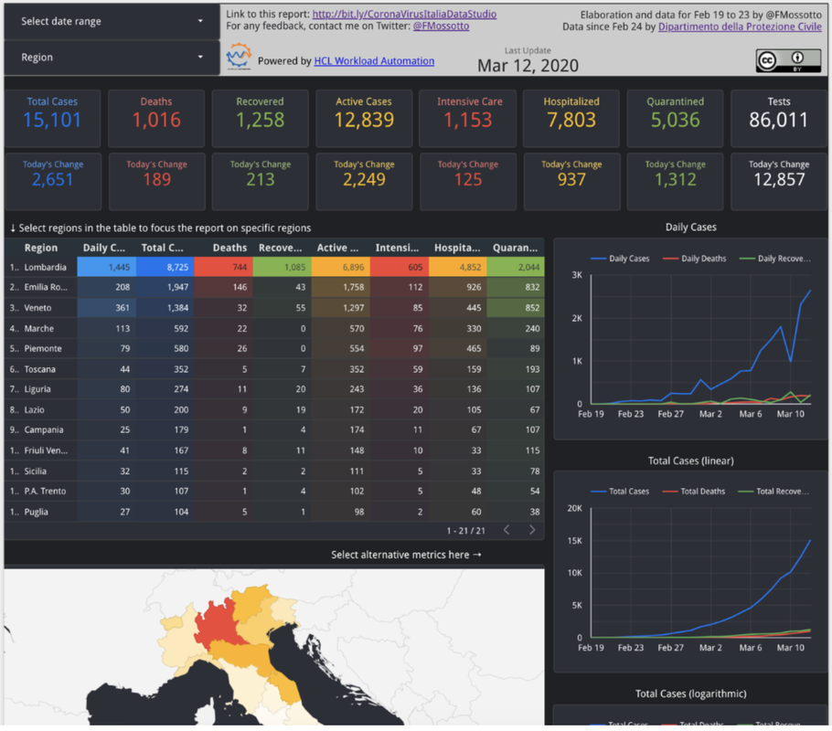
Picture

MAKE SENSE FROM DATA ​

We wanted to answer three main questions: 
  • How and where is the virus spreading?  
  • Which is the trend for active cases? 
  • Which is the death number 
  • What’s the impact on Intensive Care Units in each region? 
Long story short, we wanted to have an overview of what was happening, while making data easy to understand to anyone. 
Google Data Studio was perfect for this scope. 

AUTOMATED DATA ANALYSIS 

Second need:
 Getting the data form the official source, integrate the data, elaborate the data and publish them requires different steps and different tools, people come on the dashboard right after 6 PM CET to check how the trends are changing, if we want this to be efficient, we need to put wings on it with an automation tool. 
That’s exactly our expertise: HCL Workload Automation was our most powerful ally on the field. 
As we were saying the process of publishing data is made of several steps: 
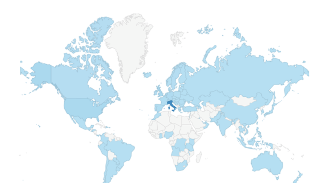
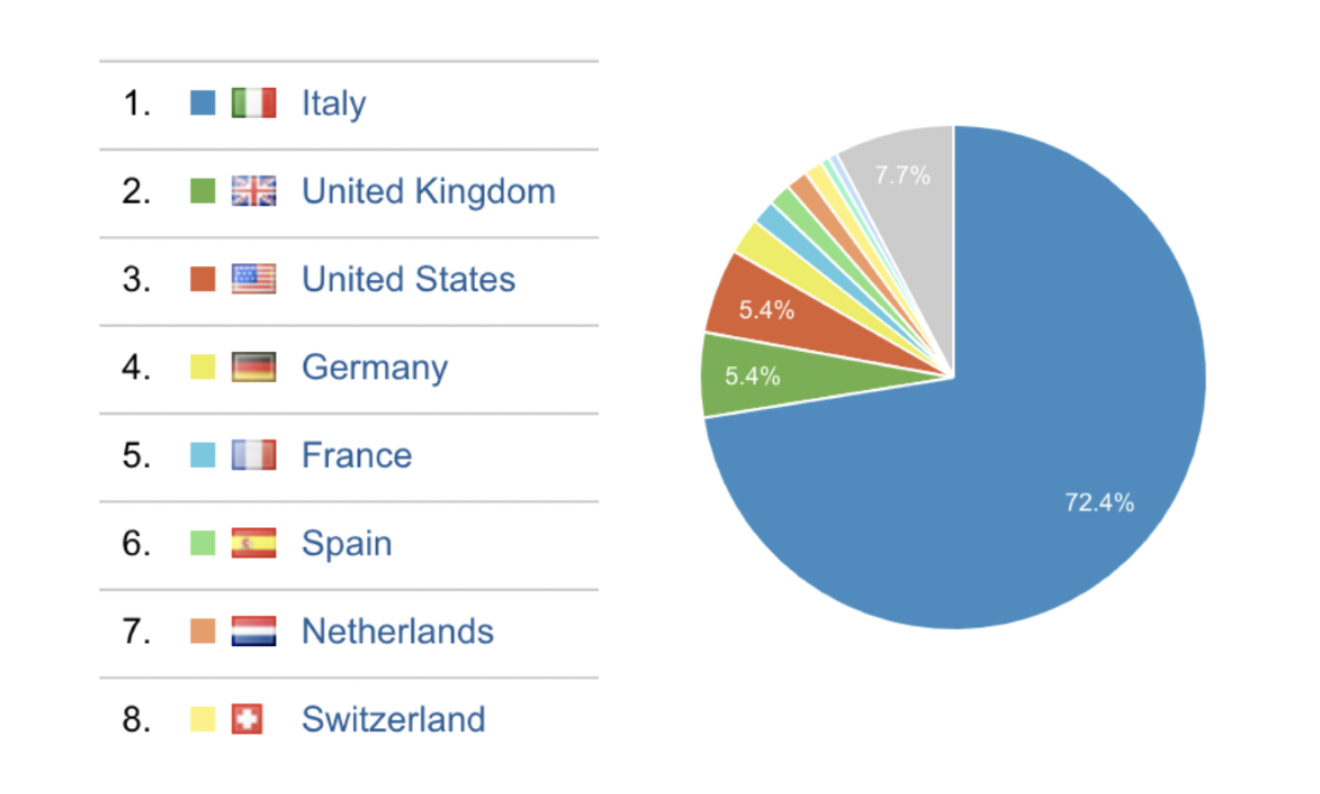
  • Data are published by Civil Protection on GitHub after the 6 PM CET press conference, it can be minutes or hours later depending on the day. 
  • When published, data are  
  • Extracted on server 
  • Merged with data we keep for the first days of the spread, when Civil Protection was not collecting yet the data 
  • Published on our personal GitHub repo 
  • At this point a Google Spreadsheet is used to elaborate the data, at this point: 
  • It needs to reload the data from our GitHub repo 
  • Formula need to be extended to new cells in order to cover the new additional data 
  • Google Data Studio needs to load the new data from the spreadsheet tables 

To
o many steps and too much expectation on refresh to happen quickly, running that manually was not an option, also considering that we are also still working at that time. Owning HCL Workload Automation, we have automation in our DNA and the availability of the right tool.  So we have created our Job Stream, with 3 Executable jobs and a RESTful job ​
Picture
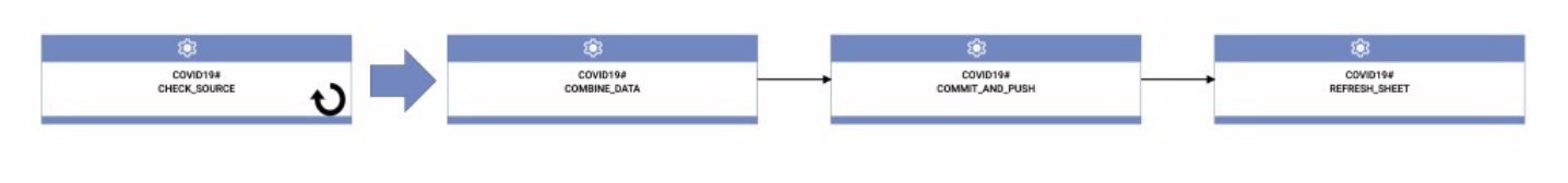
The Job Stream is scheduled every day at 6 PM CET. 

The first job CHECK_SOURCE 
runs the check_submodule.sh script that runs git pull and a git submodule update to download the latest updates from the Civil Protection repository, it then checks for the existence of the file with the today’s date, it exits with RC 0 only in this case.  This is used in a “Job condition met” Start Condition for the Job Stream, set to retry every 5 until the script exits with RC=0. We expect one update per day, so we have checked “Start once” option. The script accept a single parameter with the today’s date in order to perform the check, we use the ${tws.plan.date} to pass the job stream sched date. ​
Picture
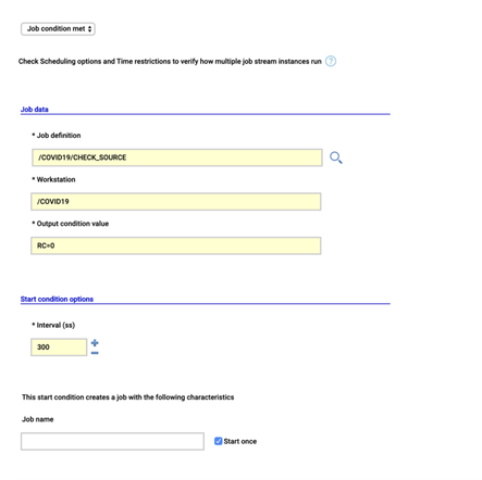
When the update is available the rest of the job stream is released, the COMBINE_DATA job runs combine.sh script to merge the data we keep for the first days of the spread, when Civil Protection was not collecting yet the data. 
Then the COMMIT_AND_PUSH data uses git command line to commit the changes and pushing that on our repository on GitHub.
 
At this point we have to update the Google Spreadsheet, the script to reload data and extend formulas runs in Google Apps Scrips running on Google Cloud. In order to call it from HCL Workload Automation we had leveraged the possibility of Apps Scripts to be exposed over https implementing the doGet function. The REFRESH_SHEET job is a RESTful job that calls the GET on Apps Script and receive back the result, in our case we just need it the joblog for troubleshooting, but it’s also possible to extract variables from the result and use them in next jobs. Of course, the whole environment (Master, DWC and agent) runs in containers using dockercompose. 
 
IS IT REALLY USEFUL? 

It is. And not just for Italians.
 According to usage data, people comes from all over the world. There is of course a bigger traffic from Italy, but other countries very close to ours and currently facing a similar situation as the one we had some weeks ago, are looking at these data: ​
Picture
Picture
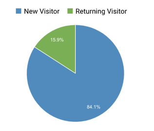
Moreover, people tend to come back to check the situation: ​
Picture
We really hope this can be useful to many people.
 
So, take a look by yourself here http://bit.ly/CoronaVirusItaliaDataStudio and let’s help us spread the word: data can fight the fake news and raise awareness for other countries. 

We are all in this together. 

​Stay at home, stay safe. 

Picture

FRANCO MOSSOTTO
Workload Automation Lead Architect
 

The lead architect for the IBM/HCL Workload Automation products. He joined IBM in 1998 as a Tivoli Workload Scheduler for z/OS developer. Franco has worked in design, development and support of IBM Tivoli scheduling and provisioning products. In the scheduling area Franco worked as developer, chief designer, L3 technical leader for both Tivoli Workload Scheduler and Tivoli Workload Scheduler for z/OS, and as an architect for the development of cloud and Bluemix offerings. Following the IBM and HCL partnership in 2016, Franco transitioned to HCL with the rest of the development team to continue his work on Workload Automation portfolio in the role of Lead Architect ​

View my profile on LinkedIn
Follow @fmossotto
Picture

EMANUELA ZACCONE
Workload Automation Product Manager
 

An experienced product manager with a strong digital marketing and digital entrepreneurship background. As Digital Entrepreneur she founded TOK.tv in 2012, reaching more than 40 million sports fans in the world before selling the company to the Minerva Networks Group in 2019. In the same year, she granted the inventor title by patenting social TV.  She completed a PhD between the universities of Bologna (Italy) and Nottingham (UK).   

View my profile on LinkedIn
Follow @Zatomas
30 Comments
Vikas Malik
3/17/2020 06:38:31 pm

This is awesome piece od auromation. Excellent ....

Reply
Emanuela Zaccone
3/19/2020 06:24:10 am

Thank you, we really hope this could help understand the real impact of covid19

Reply
Mo Nag link
3/18/2020 09:45:16 pm

I'm interested and finding ways to collaborate or partner with your team for COVID 19 data curation.

Would you be available for a quick Google Hangout in the near future?

Thanks,
Monideep Nag, CEO
Precision Den Corp

Reply
Franco Mossotto
3/19/2020 06:31:45 am

I'll contact you on LinkedIn so we can discuss if we can cooperate

Reply
Giovanni Sce link
3/23/2020 04:19:52 pm

Bravissimi, mi piace sia il concetto di combattere le fake news con dati affidabili, sia la vostra utile implementazione per tracciare/capire il coronavirus!
Essendo un senior software developer ho creato un grafico simile (oltre a altri con millioni di dati).
Vi offro la mia collaborazione se possibile per questo importante lavoro o altri mirati a mitigare il coronavirus in Italia!

Reply
Franco Mossotto
3/24/2020 08:48:30 am

Sull'Italia sulla base dei dati della Protezione Civile non c'è più molto da fare e come è descritto nell'articolo è anche automatizzato.

Sarebbero interessanti nuovi dataset da integrare, p.e.
- la mortalità totale per provincia di quest'anno da confrontare con quella degli anni precedenti
- la distribuzione per età, sesso, etc di infetti e decessi (ci sono i dati dell'ISS ma non sono accessibilissimi)

Per il resto sto cercando dati per fare dashboard equivalenti per altri paesi, ma è difficile trovare dati di qualità

Reply
Giovanni Sce
3/24/2020 02:38:34 pm

Grazie della risposta, concordo su tutto, vivo negli States and there is no reliable data.

Forse lo sapete gia', forse non rientrate nei requisiti ma ho visto di questa call for technology.
http://www.salute.gov.it/portale/news/p3_2_1_1_1.jsp?lingua=italiano&menu=notizie&p=dalministero&id=4309

Giovanni Miotto
3/23/2020 07:10:07 pm

Scusate se mi intrometto ma poichè sto apprezzando molto la presentazione dati relativa a covid19, volevo segnalare un bug che altera alcune statistiche relative al trentino alto adige. Infatti i dati percentuali (casi x 100k , e fatalita %) risultano errati in quanto riportano la somma delle due province autonome.
Sperando di essere sato utile vi porgo i miei più sentiti saluti

Reply
Franco Mossotto
3/24/2020 08:37:22 am

Grazie, me lo hanno segnalato anche su Twitter, ora dovrebbe essere sistemato

Reply
andrea
3/24/2020 07:00:40 am

scusate, sono un epidemiologo veterinario, potete dirci come calcolate il growth factor ?

Reply
andrea
3/24/2020 07:03:38 am

é semplicemente nuovi casi oggi/nuovi casi ieri ?

Reply
Franco Mossotto
3/24/2020 08:41:45 am

Ho cambiato i nomi perché mi sembrava che generasse confusione.
Ora sono:
- Daily Cases Growth Factor: nuovi casi del giorno / nuovi casi del giorno precedente.
- Total Cases Growth Factor: nuovi casi del giorno / casi totali del giorno precedente.

Se hai indicazioni per metriche migliori facci sapere, l'epidemiologia non è il nostro mestiere ed impariamo volentieri strumenti nuovi.

Nicola
3/28/2020 02:41:29 pm

Avrei bisogno di un chiarimento: la misura "Daily Cases" a che cosa si riferisce? Perche' se guardo il numero di oggi 28/3 riporta a livello nazionale 5974 casi, ma se da github scarico il csv, come "nuovi attualmente positivi" vedo 3651 e non capisco come riconciliare i due valori. Tra parentesi, i nuovi attualmente positivi mi sembra un numero molto indicativo dell'andamento del contagio.
Grazie 1000 del vostro servizio.

Reply
Franco Mossotto
3/31/2020 04:25:57 am

I "Daily Cases" le persone risultate positive al test quel giorno, i nuovi casi, che vanno quindi ad incrementare i "Total Cases"

Gli "Active Cases" o "attualmente positivi" sono le persone che hanno contratto la malattia e che ancora sono positive, cioè che non sono ancora guarite o morte.

La Protezione Civile chiama "nuovi attualmente positivi" la variazione giornaliera degli "attualmente positivi" ma chiamata in quel modo è ingannevole.
In realtà, i nuovi positivi dovrebbero essere le nuove persone risultate positive al test, il mio Daily Cases, a questi vanno sottratte le persone guarite o morte nella giornata per ottenere la variazione degli attualmente positivi

Lo ha spiegato anche Il Post qui:
https://www.ilpost.it/2020/03/23/perche-ogni-giorno-ci-sono-due-numeri-diversi-sullaumento-dei-contagi/

Reply
Paola link
4/10/2020 05:52:01 am

http://www.protezionecivile.gov.it/attivita-rischi/rischio-sanitario/emergenze/coronavirus/materiali-distribuiti-alle-regioni

Scusate c'è modo di condividere questi dati ? renderli disponibili ?

Reply
Franco Mossotto
4/10/2020 06:40:59 am

Dashboard e dati interessanti.

Se intendi avere i dati grezzi che sono sotto quella visualizzazione, dovresti chiedere alla protezione civile, puoi provare aprendo un issue sul progetto GitHub dove condividono i dati per i casi:
https://github.com/pcm-dpc/COVID-19/issues

Reply
Marco
4/12/2020 02:18:37 am

Buongiorno,come si calcola Fatality on all cases e Positive test ?

Reply
Franco Mossotto
4/14/2020 03:05:37 am

Buongiorno,
"Fatality on all cases" è calcolato come Deaths / Total Cases
"Positive Tests" è calcolato come Total Cases / Total Tests

Reply
Fabrizio
4/13/2020 02:58:54 pm

Salve, è dall'inizio dell'epidemia che seguo la vostra dashboard perchè mi permette di capire molto bene l'andamento della malattia nel paese e nella mia regione; ho notato però che il numero di positivi che ogni giorno si aggiungono ai già malati, dipende molto dal numero di test che vengono fatti, e questo genera delle fluttuazioni nel grafico dei positivi giornalieri, che di fatto ne alterano la leggibilità. Ho pensato che calcolando la percentuale di test positivi giornalieri e applicandola a un numero "standard" di tamponi al giorno, ogni giorno, si può avere un andamento più lineare, eliminando le fluttuazioni citate sopra. Naturalmente questo non si baserebbe su dati reali, ma potrebbe aiutare a capire quello che è il reale andamento del virus.

Reply
Franco Mossotto
4/14/2020 03:13:28 am

Ha perfettamente ragione, e se ne è parlato molto, per esempio su Il Post.
Mostro i dati dei test (e dei positivi, anche se anche questo è approssimativo) proprio per poter soppesare il valore sui nuovi casi.
C'è un quantità significativa di nuovi casi e morti che non vengono conteggiati e che facciamo fatica anche a stimare, sui decessi iniziano ad arrivare i primi dati ISTAT sulla mortalità generale, sui contagi bisognerà aspettare studi fatti successivamente con i test sierologici.
La sua idea non è male, ma sono restio a pubblicare proiezioni che non ho modo di verificare, se vuole provarci da solo i dati grezzi sono su:
https://github.com/fmossott/COVID19/tree/master/combined
http://bit.ly/CoronaVirusItalia

Reply
Fabrizio
4/14/2020 07:21:29 am

Va bene, la ringrazio molto per la sua disponibilità.

Reply
eugenio
4/20/2020 10:53:09 am

Grazie per questa notevole tabella, che da un mese a questa parte è il mio principale riferimento.
Anche in riferimento ad una domanda precedente di Andrea, potreste spiegarmi come può il Growth Factor diventare un numero negativo?
Non è il rapporto:
(casi giorno N)/ (casi giorno N-1) ?
Grazie,
Eugenio

Reply
Franco Mossotto
4/20/2020 11:28:12 am

Sto utilizzando 2 Growth Factors:
- Daily Cases Growth Factor: (Nuovi Casi giorno N) / (Nuovi Casi girono N-1)
- Total Cases Growth Factor: (Nuovi Casi giorno N) / (Casi Totali fino al giorno N-1)

In entrambi i casi sono tutti numeri positivi, quindi dovrebbero essere sempre positivi, ed a livello nazionale li vedo sempre positivi.
Se c'è qualche valore negativo deve essere perché i nuovi casi sono stati riportati negativi in seguito a qualche correzione. Se mi specifica dove è negativo, posso verificare.

Reply
eugenio
4/21/2020 05:06:10 am

Scusi il ritardo nella risposta.
Quello che mi è saltato all'occhio è il caso dei grafici Growth Factor della mia regione, il Piemonte.
Grazie,
Eugenio

Reply
Franco Mossotto
4/21/2020 06:47:13 am

Sì, in effetti il numero dei casi totali forniti dalla protezione civile il 9 Marzo ed il 27 Febbraio per il Piemonte erano inferiori a quelli del giorno precedente, da cui un Daily Cases negativo, da cui un growth factor negativo.
Probabilmente delle correzioni.

Ho modificato la scala dei grafici per nascondere i valori negativi dei growth factors, che non hanno senso.

Reply
eugenio
4/21/2020 07:52:34 am

Ok, grazie.
EM

Massimo Marchitto link
4/24/2020 01:34:34 pm

i dati odierni 24 aprile 2020 x persone con test e totale tamponi sono errati, probabilmente invertiti

Franco Mossotto
4/27/2020 02:48:24 am

Sì, la protezione civile li aveva inizialmente invertiti, e poi sistemati

Giuseppe Cassano
4/30/2020 06:25:04 am

1) Meraviglioso!
2) Meraviglioso!
...)
n) Merraviglioso!
n+1)
a)Vado in questa pagina
https://datastudio.google.com/reporting/91350339-2c97-49b5-92b8-965996530f00/page/RdlHB
b) Il 29 Aprile trovo scritto Daily Death 323 e Daily Recovered 2311. c) secondo me farebbe Daily Deaths 12% e Daily Recovered 88%
d) sul grafico Closed Cases invece c'è Daily Deaths 28,4% e Daily Recovered 71,6%
e) grazie ancora

Reply
Franco Mossotto
4/30/2020 09:50:43 am

Sul grafico Closed Cases ci sono % Death e % Recovered, sono cumulativi, non sul dato giornaliero.

Death: 27682 = 28,4%
Recovered: 71252 = 71,6%

Reply

Your comment will be posted after it is approved.


Leave a Reply.

    Archives

    March 2025
    February 2025
    January 2025
    December 2024
    November 2024
    October 2024
    September 2024
    August 2024
    July 2024
    June 2024
    May 2024
    April 2024
    March 2024
    February 2024
    January 2024
    October 2023
    August 2023
    July 2023
    June 2023
    May 2023
    April 2023
    March 2023
    February 2023
    January 2023
    December 2022
    September 2022
    August 2022
    July 2022
    June 2022
    May 2022
    April 2022
    March 2022
    February 2022
    January 2022
    December 2021
    October 2021
    September 2021
    August 2021
    July 2021
    June 2021
    May 2021
    April 2021
    March 2021
    February 2021
    January 2021
    December 2020
    November 2020
    October 2020
    September 2020
    August 2020
    July 2020
    June 2020
    May 2020
    April 2020
    March 2020
    January 2020
    December 2019
    November 2019
    October 2019
    August 2019
    July 2019
    June 2019
    May 2019
    April 2019
    March 2019
    February 2019
    January 2019
    December 2018
    November 2018
    October 2018
    September 2018
    August 2018
    July 2018
    June 2018
    May 2018
    April 2018
    March 2018
    February 2018
    January 2018
    December 2017
    November 2017
    October 2017
    September 2017
    August 2017
    July 2017
    June 2017
    May 2017

    Categories

    All
    Analytics
    Azure
    Business Applications
    Cloud
    Data Storage
    DevOps
    Monitoring & Reporting

    RSS Feed

www.hcltechsw.com
About HCL Software 
HCL Software is a division of HCL Technologies (HCL) that operates its primary software business. It develops, markets, sells, and supports over 20 product families in the areas of DevSecOps, Automation, Digital Solutions, Data Management, Marketing and Commerce, and Mainframes. HCL Software has offices and labs around the world to serve thousands of customers. Its mission is to drive ultimate customer success with their IT investments through relentless innovation of its products. For more information, To know more  please visit www.hcltechsw.com.  Copyright © 2024 HCL Technologies Limited
  • Home
  • Blogs
  • Forum
  • Resources
  • Events
  • About
  • Contact
  • What's new